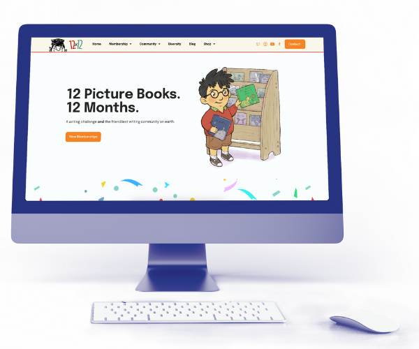
A writing challenge and the friendliest writing community on earth.
WrenPro executed a HUGE redesign of the website for my flagship program, and I couldn’t be happier with the results. It’s now a pleasure to share the link with both members and prospects, given how proud I am of how it looks and how easy it is to navigate. The WrenPro team was delightful to work with – responsive to and patient with requests. They were as invested in making the site “just right” as I was. I would never design another site without them!
Julie Hedlund,
Creator of 12x12 Challenge
Your form was submitted and we’ll be reaching out to you shortly.